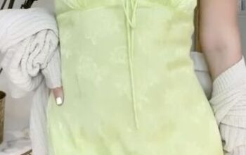
Stylish Print Outfit Ideas for Women
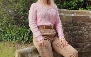
A solid foundation in plain colors is crucial for your wardrobe, as they seamlessly pair with other hues.
However, don't limit yourself to solids.
Introduce some timeless prints to your collection; they bring dimension, variety, and a touch of fun to any outfit.
I recognize, though, that prints can be intimidating for many so in this stylish outfits for women tutorial, I’m going to show you how to master the art of wearing print.
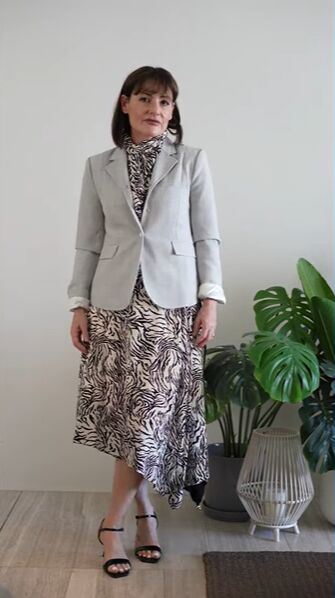
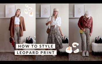
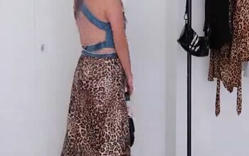
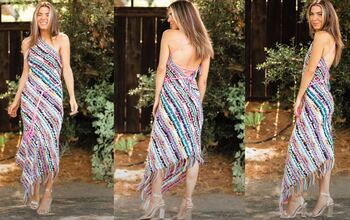
1. Print as the focal point
Here, the animal print dress is the main focal point of the outfit.
The blazer and heels serve to complement it, but they won't get as much attention as they are not the centerpiece.
I made sure to pair the dress with neutrals because I wanted it to really stand out.
2. Pairing colors
When you are not sure of what colors to wear with a print, pick one color that is already featured in the printed fabric.
3. Where to draw attention
One of the main rules of how to wear print is where to draw attention to or deviate attention away from.
If you want to draw attention to your torso, opt for a printed piece on your upper body, and at the same time, it will deviate attention from areas that you want to camouflage.
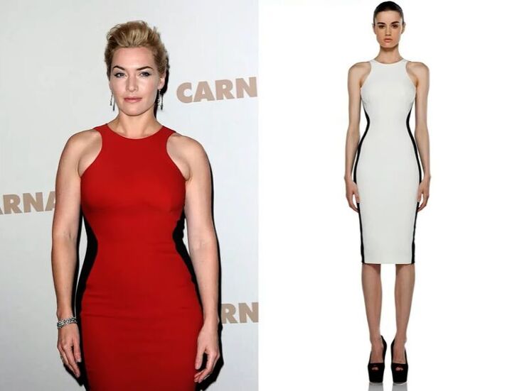
4. Creating illusions
Prints are great for creating illusions that you can manipulate to your desires.
Who doesn't remember the iconic Stella McCartney, that has the slimming effect?
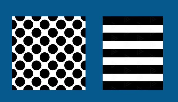
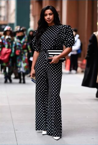
Dominant horizontal lines or large high-contrast prints like widely spaced polka dots draw attention and create the illusion of shorter, larger, and heavier shapes.
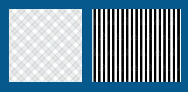
Dominant vertical contrast prints that are smaller in size, such as plaids cut on the diagonal, pinstripes, and small to medium patterns, give the effect of being taller and slimmer.
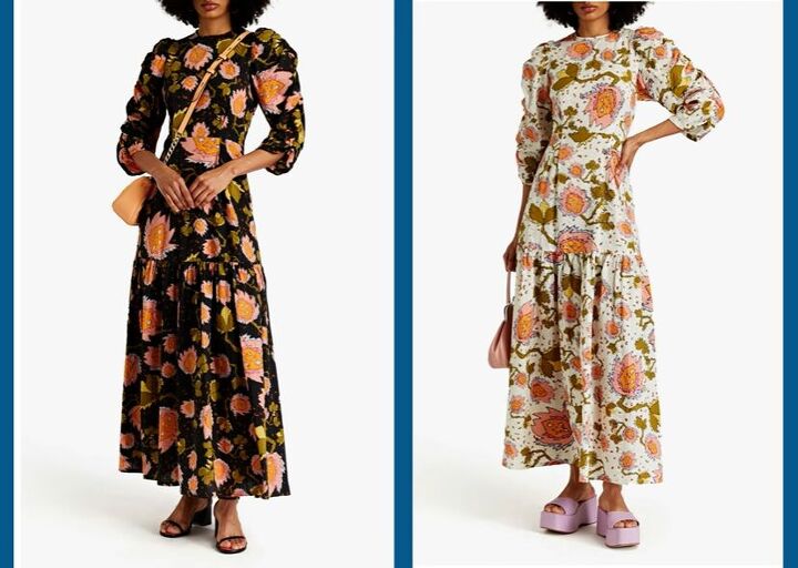
The background of the print also plays a big illusion role black backgrounds recede and decrease, whereas white backgrounds enlarge and amplify.
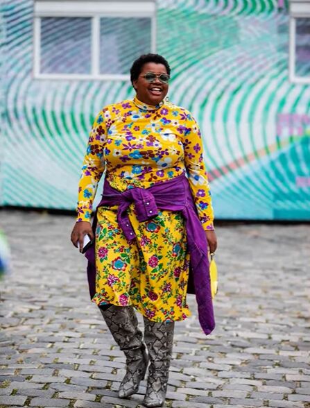
5. Consider the mood
Patterns also emit a distinct vibe and can be quite beneficial in discerning your personal style.
A preference for florals might indicate a more romantic inclination, while an affinity for sharp lines, geometric shapes, or classic prints suggests a more serious demeanor.
This small-scale print with a low contrast in soft and muted hues creates a calming effect. it's not likely to add visual size or weight to the figure.
On the other hand, if you combine light and dark colors in a printed design with large and broken shapes, the pattern will be very sharp and bold, attracting a lot of attention.
If you reduce the contrast, the effect will be much softer.
6. Understand the message you’re giving off
It's really important for you to understand the vibe that the print sends out in order to dress appropriately for the circumstance you're in.
For example, wearing a retro print top could undermine your credibility and your influence in business.
On the other hand, a plaid or pinstripe print can put a damper on a romantic evening out.
7. Dress according to your size
You should choose patterns according to your frame. Large-scale patterns can overpower a petite frame.
On the other hand, tiny little prints can really get lost on a larger frame. Medium-scale prints in bright colors can be terrific on a large figure.
8. Dress according to your coloring
You can wear patterns with a stronger contrast if you have stronger contrast in your personal coloring.
Combining patterns isn't as easy as combining texture or color because it involves the coordination of lines, shapes, color, and texture all at once.
But, when done well, it adds an element of surprise and sophistication that's well worth the effort.
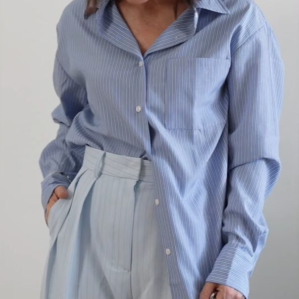
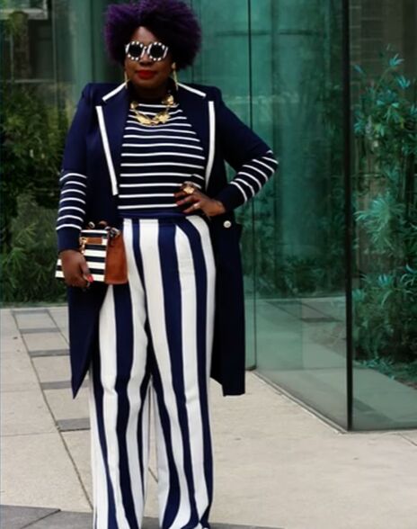
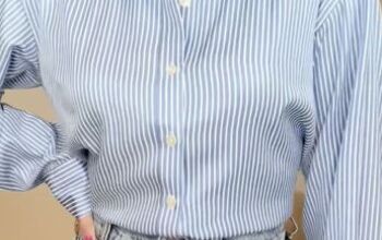
9. Lines and lines
Regarding the colors, they should relate to one another so they should either be the same family colors or they should be contrasting colors.
This striped shirt, although it's slightly darker and in a different scale than the pants, still makes an interesting print combination because the colors relate to one another, and the prints are the same.
When the patterns are exactly the same, a little difference in the scale is really interesting.
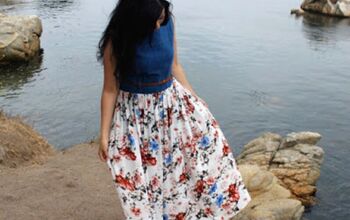
10. The art of print clashing
The look of a red floral blouse and brown abstract skirt don't combine well.
The red and the brown, as well as the prints themselves, don't relate to one another in any way.
Each piece communicates a different feeling.
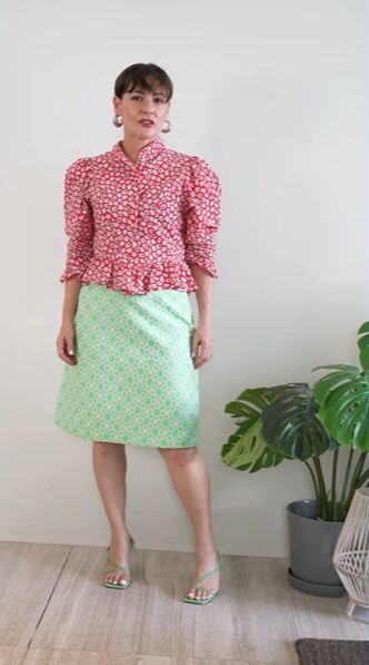
On the other hand, the green floral skirt and the red blouse work well.
They share the same scale, and they both have white in common. Most importantly, they communicate the same vibe.
Stylish print outfit ideas for women
Understanding the functionality of patterns, and how they contribute dimension, fun, and interest to your wardrobe, will enhance your fashion acumen.
I encourage you to explore and experiment with the prints that resonate with you - have fun styling!
Next, learn How to Style 4 Classic Clothing Items With a Contemporary Twist.
The author may collect a small share of sales from the links on this page.


Comments
Join the conversation