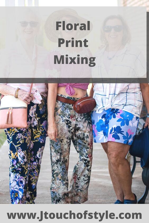
Popular Ideas for Advanced Floral Print Mixing
Print mixing is one of those things that not everyone is on board with. Yet I consider it advanced styling. It’s kinda like going to college for pairing your clothing.
Elementary schooling would be combining solids. High school is about incorporating a print item and solid piece together. And then once you start learning more and more, you are ready for advanced styling.
My analogy is like once you start reading War and Peace, you rarely go back to reading books like Dick and Jane for your own pleasure.
Insider tip: Our mindset and attitude can be the key. I believe our outfits should showcase our personality, which is very multi-dimensional. Don’t get stuck in only ONE kind of style.
So I played with 10 different options with print mixing-8 of them are below and the other 2 are on my blog post. I’ll give some narration of why I paired them together and if I liked it. Because remember! Not every outfit is going to be a favorite yet that doesn’t mean we failed!!
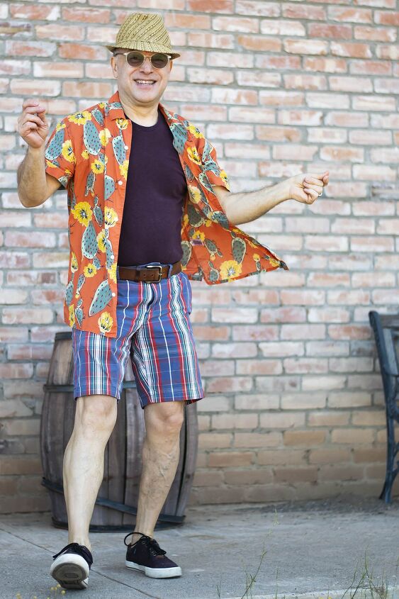
Rob and Plaid
When we were taking photos, I realized that my husband was basically print mixing with floral too. His cactus and flower shirt is a bold print mixing option with his plaid shorts.
This photo might suggest to you that Rob is a fun guy with lots of interesting backstories. And you would be right!
Just look at how he danced around for the photos. This is no wallflower of a guy, and the outfit mirrors that.
Why did he pair these clothing items together? There’s no matching of color, but he wore a dark undershirt and sneakers to contrast with the prints.
The print pieces both have a brighter hue and medium value, which is why they work together.
BTW, I love this. Of course, Rob has been reading my blog since it started and his style has evolved wonderfully.
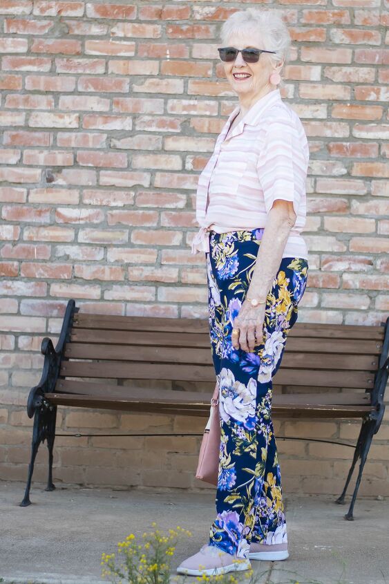
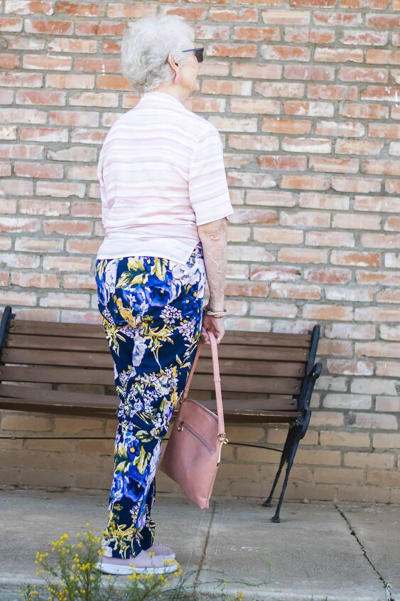
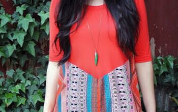
Charlotte’s Floral Print Mixing-Stripes
Charlotte found these jeans while thrifting and I twisted her arm to buy them. I love the colorful aspect and they fit her great.
The funny part is how she’s worn them with yellow in the past. I’m glad to see how other colors work with them, and how they play well with stripes.
Other posts with these same jeans:
Why did she pair these clothing items together? The obvious answer is that I asked her to, haha! But in all reality, my mom didn’t like the original outfit I asked her to wear. So she chose to pair a bright and strong color print (the pants) with a subdued and muted print (the top)
This is a nice way to dip your toes into print mixing because the muted option can almost seem solid.
I love this combination for my mom and I hope she wears these jeans with other colors and prints.
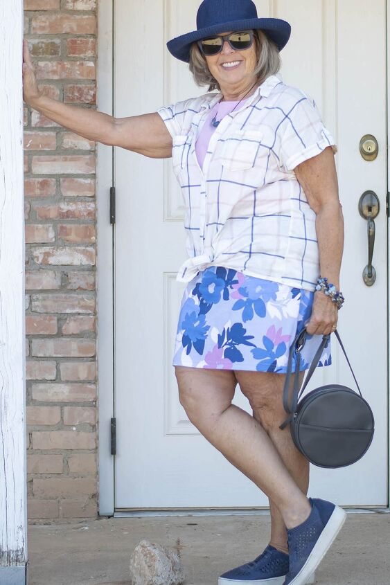
Lesley and Windowpane
I wasn’t sure Lesley would be open to this idea, but she came through like a trooper. In fact, the time we styled each other, my mother created a mixed print outfit with this same top.
Why did she pair these clothing items together? Lesley’s windowpane top is predominantly white and thus works beautifully with the floral skort. Besides, the top and skort have all of the same colors in them plus she added a light pink tee under the windowpane top.
She’s grounded the look with her darker shoes, hat, and purse.
I adore this look on Lesley. Even though it’s not her normal to mix prints this way, I hope she continues experimenting.
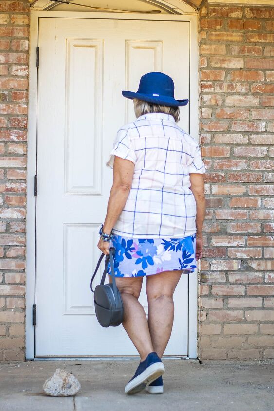
Pants: Zara-thrifted~~ Top: ~~ Shoes: Jambu “Erin” c/o~~ Purse: Amazon~~Hat: thrifted
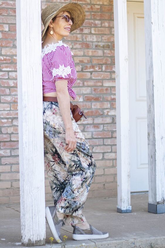
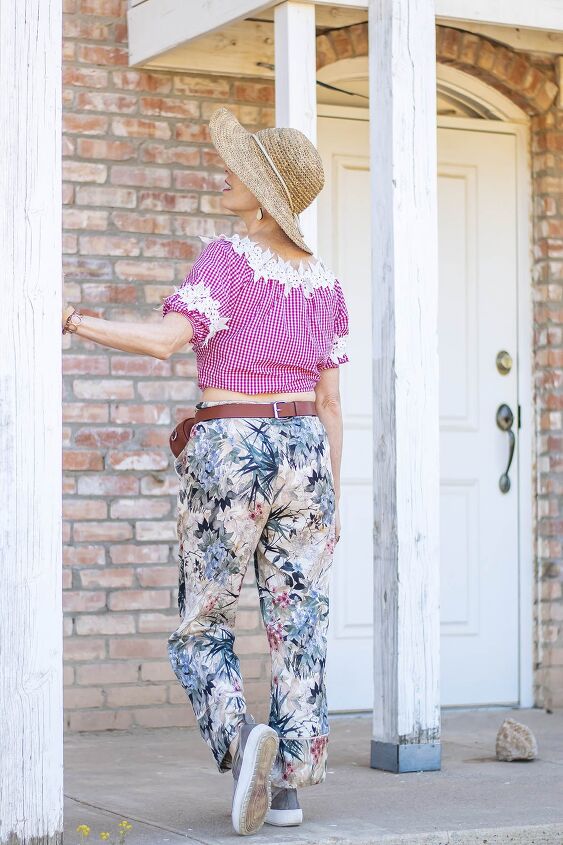
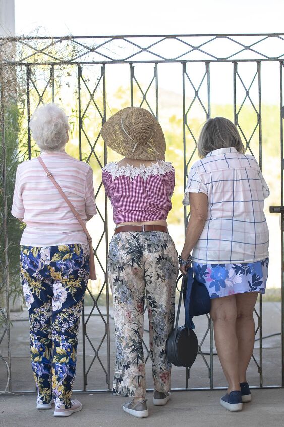
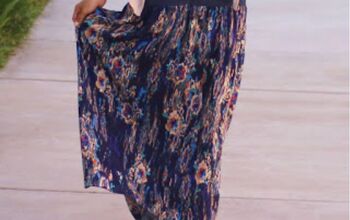
Floral Print Mixing with Gingham
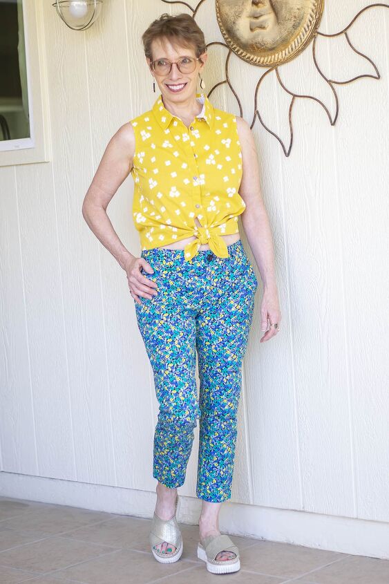
I have a plethora of floral pants (no surprise there) and decided to wear this pair out for our adventure of the day. One reason is they are a silky material and very lightweight. The day was forecasted to be a hot one and we would be mostly outside.
When I first purchased these pants off of Poshmark, I thought they might be pajama bottoms. But they aren’t because they have a zipper and are the Zara brand.
Related post: These pants when worn with a white tee.
The pants aren’t particularly flattering to my body shape with the width and length of the pant legs which is one reason I opted for showing off my midriff.
Insider tip: Change the focal point of your outfit if you don’t “LOVE” one particular item. Not all eyes need to be on that thing you don’t love.
Why did I pair these clothing items together? This pair of pants is more muted, yet has patches of red in it, which is why I focused on the red gingham.
Instead of having the two prints touch each other, the space of the midriff PLUS the belt bag breaks it up a tad.
I wasn’t entirely sure about this look, but when one of the 20-something women at the Pioneer Living Museum complimented me, I was sold.
Other Options for Floral Print Mixing
When I found that I had so many pairs of floral pants, I decided to see the variety of floral print mixing that could be accomplished.
I’ll list the other options below and why I paired them together.
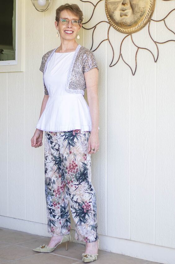
Floral and leopard. I thought by adding the leopard shrug over the plain white shirt, broke up the two patterns nicely. Also, both prints are muted and have low contrast.
I loved this option.
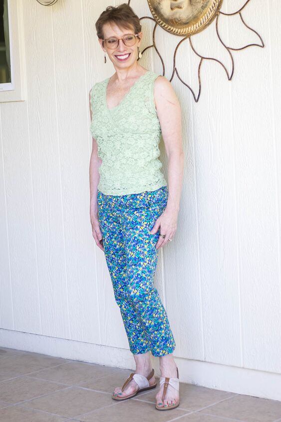
Floral and Texture. You can consider a textured piece as a print since it’s “busy”. Therefore, with the blue floral jeans, I chose a lime green, lace top.
Even though there isn’t any lime green in the floral, the green blends well because of the yellows and greens in the print.
This is one I would wear over and over.
Floral and Floral. Repeating the print in both pieces is always a fun experiment. For my example, I used one large spaces print (the top) with a small busy print (the jeans). Again, I wore a body belt (haha, my new term for showing some midriff) to break up the two prints.
I consider this outfit fun and vibrant.
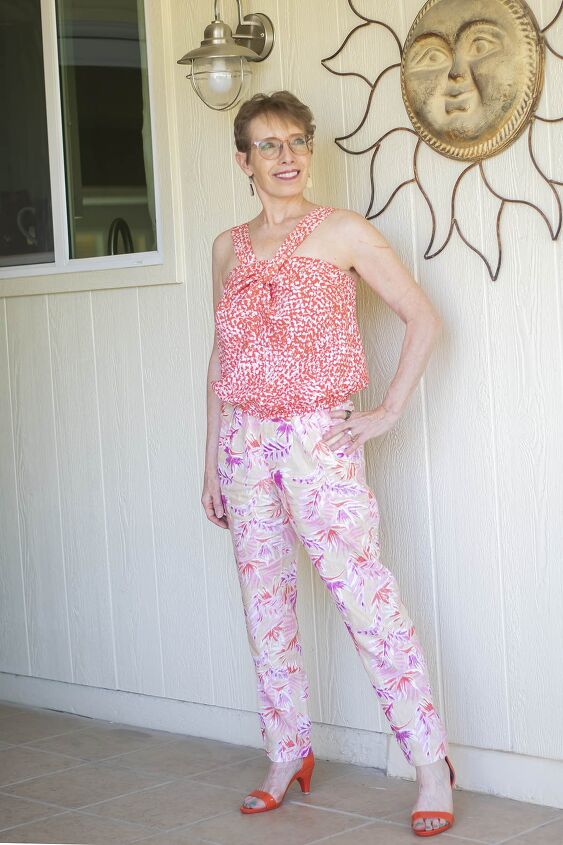
Floral and abstract. I chose an abstract print that had the same colors as the colors in the pants. Since the print of the top is small and busy, it counters nicely with the larger floral print pants.
I like this one. The orange color brightens up the pants.
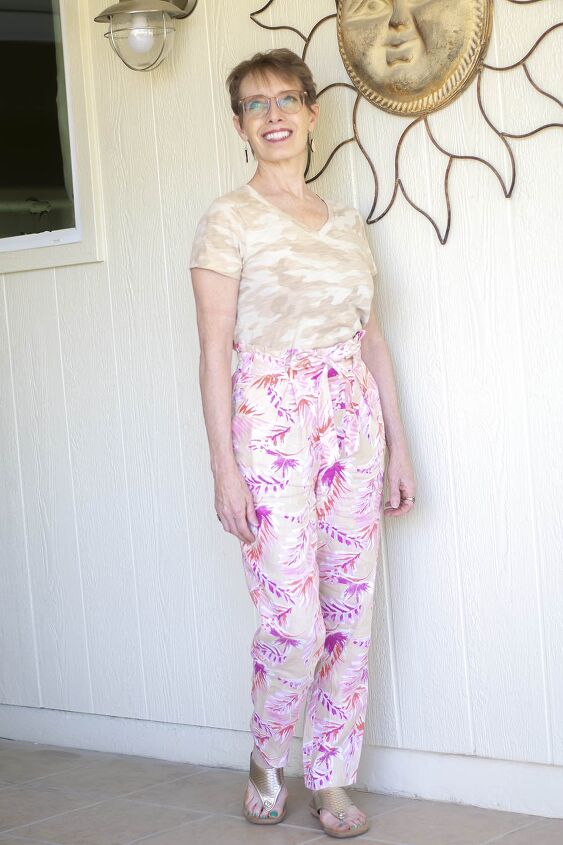
Floral and camo. Camo comes in all colors now, and I grabbed my tan one to blend in with the pink floral pants since the background is a muted tan.
This isn’t my favorite look. Even though the background of the pants is tan, the outfit seems washed out to me. Then again maybe it’s because both prints are about the same size?
Make sure to check out the blog post where I feature embroidery and polka dots with a pair of floral pants.
The author may collect a small share of sales from the links on this page.


Comments
Join the conversation